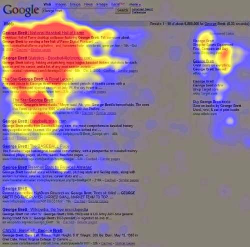
Most of the people do not understand how people use a website. However, there are lots of different studies out there describing exactly how most users consume web pages. The Google heat map is the best example of it. Find out below.
It shows where people see when they do search Google for content. As a web developer, It is important points to keep in mind.
Seven Facts About How People View Websites :-
1. Text is better than images
Banner blindness was a real problem at the early stages of the web, and it is even worse in the current era.
Image sharing is good only on image sharing sites and place like Reddit.
2. People view the top left corner first
Generally, People start to scan from the top left to downward with the right column. It is called the "F Shaped Profile" and is a different way than read a book.
3. Fancy fonts generally get ignored
Generally, Fancy fonts use for adverts and business logos. However, it is ignored by people while they are searching for any important information.
4. People only scan briefly the footer parts of the page
Some users scroll down at the bottom to get the information like a privacy policy or contact details.
So, It is necessary to make sure that eight your website is proper enough of not.
5. Short paragraphs and lists
Short, sweet and meaningful sentences are always helpful. So, consider this point as an important note.
6. White space works!
White space is good enough for you while converting users into customers on a landing page. So do not be tempted to fill it.
7. Many users will ignore vast amounts of text
No one cares about big paragraphs and too much deep information. So, You should take care about it.
Reference : http://www.sudorank.com/8-facts-about-how-your-website-is-viewed-by-users/
It shows where people see when they do search Google for content. As a web developer, It is important points to keep in mind.
Seven Facts About How People View Websites :-
1. Text is better than images
Banner blindness was a real problem at the early stages of the web, and it is even worse in the current era.
Image sharing is good only on image sharing sites and place like Reddit.
2. People view the top left corner first
Generally, People start to scan from the top left to downward with the right column. It is called the "F Shaped Profile" and is a different way than read a book.
Generally, Fancy fonts use for adverts and business logos. However, it is ignored by people while they are searching for any important information.
4. People only scan briefly the footer parts of the page
Some users scroll down at the bottom to get the information like a privacy policy or contact details.
So, It is necessary to make sure that eight your website is proper enough of not.
5. Short paragraphs and lists
Short, sweet and meaningful sentences are always helpful. So, consider this point as an important note.
6. White space works!
White space is good enough for you while converting users into customers on a landing page. So do not be tempted to fill it.
7. Many users will ignore vast amounts of text
No one cares about big paragraphs and too much deep information. So, You should take care about it.
Reference : http://www.sudorank.com/8-facts-about-how-your-website-is-viewed-by-users/


0 comments:
Post a Comment